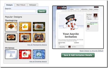
Yesterday, we rolled out a new release of Anyvite. This one has been a long time in the making and there are literally hundreds of fixes and improvements. The most noticeable is a redesign of the Invitation creation process. In the new process, you can customize the look of the invitation using our themes, mixing and matching our pictures, searching flickr, and/or uploading your own pictures. This new approach has everything you need to customize your invitation on one page instead of spread over multiple pages as it was before. Of course, you can skip this step and head right to entering the details by clicking the skip button in the top right.
Step two of the invitation creation process is now adding in the invitation details. The big change on this page is that we removed the section for inviting guests and moved it to step three. This helps focus the invitation details page solely on the details and makes it much less intimidating!
Another big change is the redesign of our navigation. Before, our sub-navigation was located in the right column on each page taking up valuable screen real-estate and often becoming lost in the items around it. Now, it’s located at the top of the page directly under the open tab.
This gives us more room on the invitation for important things like the guest list while centralizing all of the navigation in one place.
So check out the updated site and play around with the themes and create your holiday invitations. Let us know what you like and what you’re not so crazy about. We’ve received a ton of feature requests from you over the past month, and while you may not see your feature implemented this time, stay tuned because we’ve got some big things coming up!


