Working Towards a Better Address Book, Easier Ways to Share Invitations, and More Color Schemes

It’s been a while since we last wrote, but be rest assured that we’ve been busy. In the past couple of weeks, we’ve done a lot of backend updates to make the site faster, handle larger invitations, and fix a number of pesky bugs.

Those are some things that you may not have noticed, but one thing we’re sure that you did was the new version of the address book. The most common request that we receive is for a better way to manage invited guests. The new address book is the first step towards significantly improving the process of managing your guest list. Rather than waiting for all parts of the process to be fully complete, we decided to release the parts that were ready, and get feedback on what people like and don’t like. This is your chance to help shape a critical part of the service, so we’d love to hear your thoughts (via the feedback tab of course).


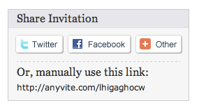
Another feature which we’re really excited about is the ability to share invitations quickly and easily on Twitter, Facebook, and a host of other services. All you have to do is set an invitation to “Open” and the options will automatically show up once you send the invitation. Try it out and let us know what you think!

Finally, we’re continuing to add additional customization features to Anyvite. In addition to new designs and categories, we’ve also been adding new color scheme options. You can find the color schemes below the invitation preview on the design page. Simply click the arrows to the left and right of the color schemes to scroll through all of the choices. Experiment with a few and let us know what you like and/or what you think is missing and should be added in.

Alright, those were a few of the updates. Look for more in the coming weeks as we continue to build out the new manage guest list functionality and add in some new features. In the meantime, start creating your “Cinco de Mayo” invitations before it’s too late!

Comments can now be disabled

Slowly we’ve been giving invitation creators more control over what is shown on the invitation. Today we finally added an option for the last major piece (still lots of minor things though!). Invitation creators are now able to hide the comment board on the invitation page for those times when they’d rather not have a big list of people saying why they can or can’t come. Of course, there are times when the commenting really adds to the invitation so only disable it if you don’t want your guests chatting before the event!

We’ve also fixed a some little bugs that were introduced when we did our big update last Friday but overall things should be running pretty smoothly.

St. Patrick’s Day is in two weeks. If you haven’t sent out your St. Patrick’s Day invitations, now’s the time!

New version with lots of Updates

We just released a new version of Anyvite and it’s got a lot of great things that we’re really excited about! Some of the changes are obvious and some are hidden away.

The biggest change that you’ll likely notice right away is a pretty massive redesign that significantly alters the look of Anyvite. The previous version of Anyvite hadn’t changed drastically since it was called Coordinatr and while we moved around the navigation and made it a little wider, the site maintained the darker color scheme and rounded box in the middle of the page. The new design brightens things up a lot. Every time we switched back and forth while developing it, I couldn’t help but notice how much happier it seemed. Hopefully you’ll feel the same way!

The new design brought with it a nice blue header which goes great with our logo. But having a blue header on a site that allows you to change the background and main picture seemed like a bad idea. No one likes a clashing invitation (which is why you switched from another electronic invitation site in the first place ;-) . So we’ve also added in the ability to choose a color scheme. For now, have seven color schemes including the default which should help you customize the invitations even more. In the future, we want to provide more customization options so think of this as just the first step!

Speaking of more customization options, one of the other big changes in this release is that we’re going to soon start beta testing some of our more business oriented features including in-depth customization capabilities. For example, using our new (and still unreleased) theme editor, I created the invitation below (click on it for a larger version) mimicking an old computer terminal screen. We’ve got a lot of tech users that I think would appreciate this one, but we’re not quite ready to release invitations customized to this extent yet!

If you’re interested in getting more information about our plans for premium offerings, send us an email to support@anyvite.com.

So those are some of the big changes we’ve been working on. We’ve received a ton of feedback and we realize there’s a lot that’ is still left to do. You can help by trying Anyvite and sending us feedback on what you like and what you don’t like.

Sometimes the best updates are the ones you never see!

This past week we’ve made some great updates to Anyvite that should drastically improve of speed of the site when interacting with large invitations.  The biggest change comes from a change to how we send notifications.  Instead of making you wait for invitations to be sent, resulting in long page load times, we now send them separately so things that used to take a while like inviting a bunch of friends or launching the invitation should now be snappy!Anyvite Change RSVP Window 

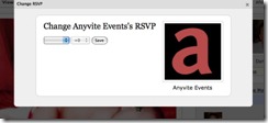
The other change will benefit the Invitation organizers of larger events.  In the past, the ability to change guest’s RSVPs was done in the guest list which meant we were always constrained on space and it was a bit heavy to download.  We switched this to a modal box so we have a bit more room to work with and we can load everything dynamically making the page smaller so it works better in slower browsers (cough IE cough cough…I must have come down with something).

What else would you like to see?  We’ve got a long list, but keep the feedback coming!  And check out the great themes we have for upcoming occasions like Super Bowl® parties, Valentine’s Day invitations, and St. Patrick’s Day events!

A Much Needed Update to the Dashboard

One area that we’ve been meaning to improve for a long time now has been the dashboard. The aim was always to provide significantly more information on the dashboard than just invitations, so that a user could have a grasp on where they stood with their entire Anyvite account in just one glance. Unfortunately, up until now, other areas have received our attention, but we were finally able to squeeze in a window of time to take another swing at the dashboard.

The new Anyvite dashboard is still centered around your invitations, but now also displays the contacts in your address book, groups which you’re a member of, current weather and forecast for the coming days (very helpful for events taking place outdoors), and popular invitation designs. In addition, we’ve made it easier for newly registered users, who don’t have any invitations, to get started on the creation process right from the dashboard.

We still have a lot of things that we want to improve and add to the dashboard, but figured this little tune-up was a good start on that improvement process. Keep an eye out for incremental tweaks and additions going forward, and please send us feedback as to what you like and don’t like with the new setup!

Good things come in threes

Anyvite received a few more updates over the past two days. Here are a few of the changes:

Export your Invitation Guest List20081210-d6eyewcam5nunt3nue3nmxi7jn
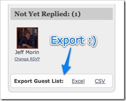
You can now export your invitation’s guest list to both Excel and CSV formats. The Excel format we’re using is a bit older and may not work in some newer programs (except any version of Excel within the last decade) which is why we also added CSV exports for the other applications (like Numbers).

The new export options are at the very bottom of the guest list so if you can’t find them, scroll down!

Allow Guests to “Invite people” and “Bring people” are now separate
This one is a bit more confusing. There are two options to account for extra guests in an Anyvite invitation. The first is to add them to the guest list so they can view the invitation in Anyvite while the second option is to just use the +Number dropdown when RSVPing. Previously, both of these options were controlled by the same configuration option. NO MORE we said (actually, you said it…) and we split them apart. So for parties where you want your guests to be able to bring a date, but not actually invite outsiders, you can now do it with Anyvite!

Limit the number of people a guest can bring
Another problem with the previous scenario was that you couldn’t limit the number of people your guest could include when RSVPing. So if you wanted your guests to only bring a date but not their entire extended family, you had a problem. So last, and possibly least of today’s feature upgrades, is the ability limit the number of people a guest can include while RSVPing.

We threw in some other goodies along the way. For example, your guests are now sorted by having a profile picture set first and then their name so guests with a picture set will appear before guests without it. The goal is to make the invitations look more exciting which actual faces accomplish better than grey question marks. Let us know what you like and what you don’t like! And remember to get started on your holiday invitations soon!

Style your Invitation Description and A New Look for Emails

After our latest release, which included the new configuration options for Anyvite, we received a lot of feedback about the need to format the actual text of the invitation.  Since then, we’ve been hard at work adding in the functionality for event creators to be able to customize the invitation description to their liking, and as a byproduct of that, we’ve finally given the emails a much needed facelift.

The format of the emails has been improved to take advantage of the newly styled invitation description, as well as to enable guests to easily invite additional people, change their notifications, and view what they’ve currently responded with (yes, no, or maybe).

Take a look when you have a chance and let us know what you think!

Big Site Update: Themes and more

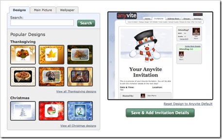
Yesterday, we rolled out a new release of Anyvite. This one has been a long time in the making and there are literally hundreds of fixes and improvements. The most noticeable is a redesign of the Invitation creation process. In the new process, you can customize the look of the invitation using our themes, mixing and matching our pictures, searching flickr, and/or uploading your own pictures. This new approach has everything you need to customize your invitation on one page instead of spread over multiple pages as it was before. Of course, you can skip this step and head right to entering the details by clicking the skip button in the top right.

20081124-dh6eus7n3agxwsdh7dk9jgbebp

Step two of the invitation creation process is now adding in the invitation details. The big change on this page is that we removed the section for inviting guests and moved it to step three. This helps focus the invitation details page solely on the details and makes it much less intimidating!

Another big change is the redesign of our navigation. Before, our sub-navigation was located in the right column on each page taking up valuable screen real-estate and often becoming lost in the items around it. Now, it’s located at the top of the page directly under the open tab.

20081124-8238kp86bf7ai6fgtdm26rcn4n

This gives us more room on the invitation for important things like the guest list while centralizing all of the navigation in one place.

So check out the updated site and play around with the themes and create your holiday invitations. Let us know what you like and what you’re not so crazy about. We’ve received a ton of feature requests from you over the past month, and while you may not see your feature implemented this time, stay tuned because we’ve got some big things coming up!

Sneak Peek: Anyvite Events Widget

We’ve started getting more requests from users asking about ways to display Anyvite events on their own sites and blogs.

We’ve had RSS feeds, but that’s not ideal for displaying your events to the public, so today we want to announce our first step toward being more open.

We’re in the process of testing a widget that you can embed in your website or blog that will show any upcoming open events that you’re hosting or attending. This makes it ideal for groups to list their upcoming events or anyone who attends/hosts events!

One of our first beta testers is Adam Gartenberg. Checkout how he’s using the Anyvite Widget!

We’re still working on finalizing and improving the widget so for now, if you’d like to try it, just send us an email at support@anyvite.com and we’ll send you a link.

Remember that Thanksgiving and the holiday season are fast approaching so get started on your Anyvites soon!

More Contacts, less SPAM, and a new Homepage!

We’ve got some more exciting new features to tell you about! Our last post introduced importing your evite contacts into Anyvite. We’ve heard from a number of users both on the site and in twitter (here’s a good one) and we thank you for all of the positive feedback!

Continuing on the Contacts theme, we just rolled out a new Contacts Importer for the three main webmail clients: Gmail, Yahoo Mail, and Windows Live Hotmail. With our new importer, we’re taking advantage of some new interfaces that these services provide which results in a more secure transaction. So from now on you’ll never have to give us your password to these three services!

You can try the new importer by clicking on the yellow “Import Email Contacts” button on any address book page. Try it out by creating a new event!

We also still have the Plaxo widget which you can use to import contacts from other services and file formats until we’re able to support them all natively. To access it, click the long box across the bottom of the window with the AOL, Outlook (Express), and Plaxo icons.

On another note, we’ve started to attract enough attention that even the spammers have begun to take notice. We’re serious about spam and having it delivered through our service (via fake events) is unacceptable. So, we’ve started taking measures to prevent SPAM events from being created in Anyvite. The steps we’ve taken are just a start and our goal is to remain ahead of the spammers and protect our users. Hopefully, it’s something you’ll never even notice is there, but we want you to know we’re working hard to make Anyvite the best invitation service available.

And on a lighter note, we’ve also updated the Anyvite Homepage. The new homepage has multiple images that rotate through each time the page is reloaded so try refreshing and see if you can guess the holiday! We also rotate through some of our favorite Anyvite tweets which we thought would be a bit better than boring user testimonials. If you’d like us to add your tweet to the homepage, just send it out to your friends. If it’s one of the best Anyvite tweets ever, we might put it up there!

Thanks again to everyone who has tried Anyvite and sent us feedback. It’s been a great September with a new record number of visitors and a record number of events created in one month! Keep up the good work and let us know what we can do to make your invitations more enjoyable!

« Newer PostsNext Page »

« Previous PageOlder Posts »